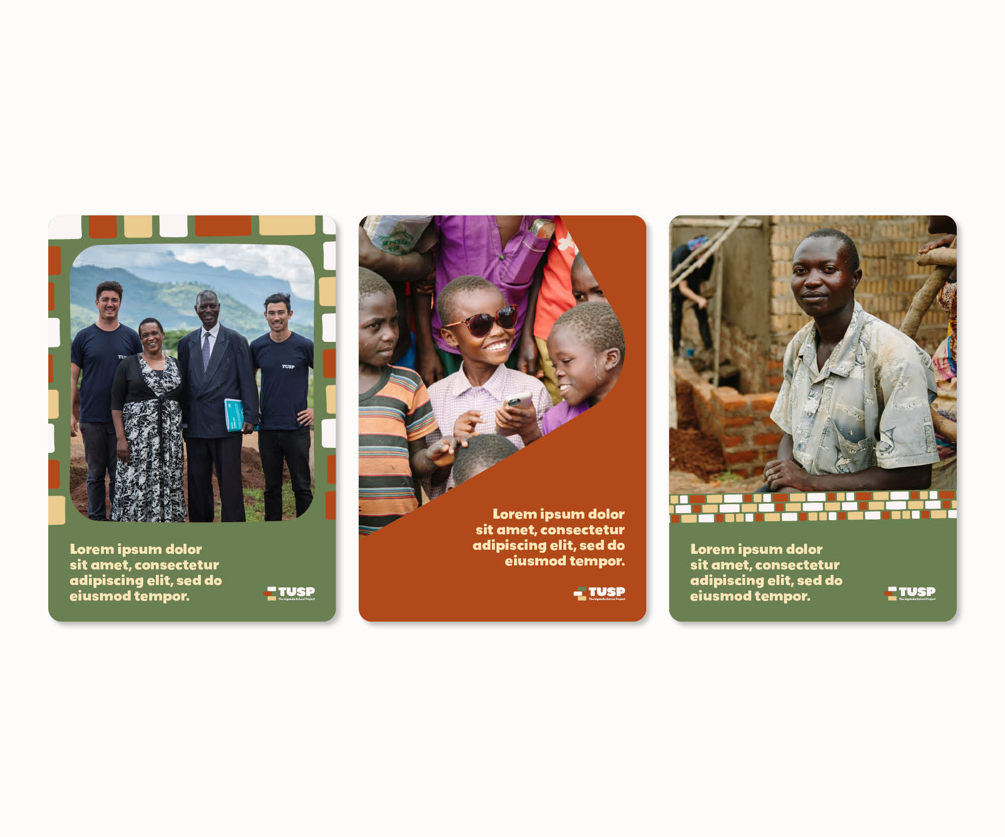
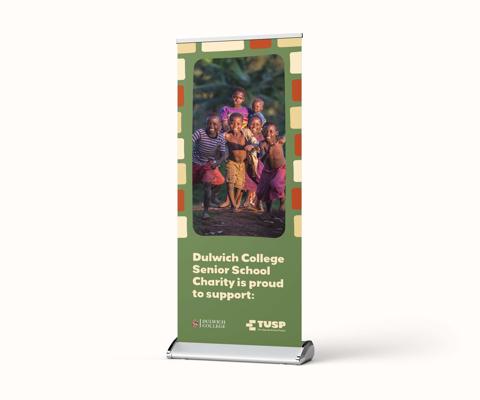
Project in brief

The Uganda School Project (TUSP) provides access to quality primary school education in rural Uganda & has been doing so for over 7 years. They identify areas where access to quality education is lacking and in collaboration with the local community, help to develop proper educational infrastructure that will improve learning outcomes. Having reached a stage in their journey where they felt their brand and visual identity no longer reflected the ambitions and growth of the organisation, we worked with TUSP to reimagine their brand, creating a comprehensive brand guidelines and a new website.

What we did

  • Visual Identity
  • Brand Guidelines
  • Tone of Voice
  • Website Design & Development
  • UI/UX

Building blocks

After an initial briefing with TUSP to fully understand the mission, vision, values and aspirations of the organisation, OXygen provided two conceptual routes for discussion. The chosen route, takes direct inspiration from the colours of the rural Ugandan landscape, the rich red of the soil, lush green and sunset yellow.

The identity is built around six unique bricks, three square and three rectangular, to reflect TUSP’s work in building both the infrastructure needed to support an education; classrooms, latrines, and tanks to collect clean drinking water, and their dedication to sustainability and collaboration: believing that building something together with local communities, with shared ownership, is the way to make their impact last long into the future.

The shapes are softened and irregular, and married with an organic typeface, helps to produce a vivid and playful identity (TUSP’s is a serious mission, but they also wish to represent the joy a good education can bring) that captures the unique and personal nature of TUSP’s work.

The Uganda School Project brand guidelines

Framing key content

With the visual identity agreed, the team created a full brand guidelines including logo usage, tone of voice, colour palette and templates for posters, brochures and social media. The bricks are used playfully throughout to create patterns and frames for content, helping the reader to focus on key messages, visuals or calls to action.

Mockup of TUSP website homepage

Helping drive support

We helped TUSP reimagine their new website, with dedicated calls to action to donate or support the charity, bold use of colour and consistent use of the new iconography.

View the TUSP website
Mockup of TUSP website homepage
96
Homepage SEO Performance Score
18
reduction in Carbon per page view
96
accessibility score

The new aesthetic of the organisation will help our supporters recognise, connect with and support our mission, and reflect the values we hold dear. It is bright, colourful, positive and playful. This mirrors our focus on the power of education in having a positive impact on society, working together with communities to uplift its citizens, and showcasing the impact providing a safe, supportive learning environment can have on a child - one that they will carry with them and build on for the rest of their lives.

Sean RichardsonThe Uganda School Project